

Build a design system before the next development cycle i.e. one month.
Nine months into scaling, The Arc, a news media startup focused on India’s high-growth companies, began facing growing UI inconsistencies and slower iteration cycles. Engineering had already invested heavily in custom components, which ruled out adopting an off-the-shelf design system.
PROJECT OVERVIEW
We designed and shipped 500+ components & set guidelines for the future, improved consistency across the product, and reduced design and tech debt.
Design System Research: Reviewed 4 mature design systems (Uber, Atlassian, Mosaic Wellness, Google) to understand best practices for file organisation, component hierarchy, and documentation.
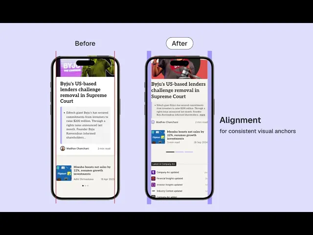
UI Audit & Gap Analysis: Audited existing screens to identify visual inconsistencies and redundancies such as duplicate fonts, spacing issues, and unaccounted icons.
Foundation Setup: Defined system guidelines for spacing and grids, colour usage, iconography, and a scalable type system.
Component Consolidation: Compiled components across pages and organised them into atoms, molecules, and organisms to improve reusability.
System Assembly & Handoff: Structured a developer-friendly component library to support faster MVP builds and consistent future iterations.


We collated all components across the MVP to understand the scope of the project.
To fix consistency-related issues discovered in the audit, we segregated the collated components into atoms, molecules and organisms, set guidelines, and documented everything .

COLOR PALETTE
The existing color palette was retained since it worked well. However, we extended it with additional variations to give more variety for UI and graphic creation across the product.

We leveraged 'Hero Icons' library as a base to save time, which supported multiple icon sizes and styles through micro, mini, outline, and solid variants.
We derived the type scale by deconstructing live MVP screens, identifying text patterns, removing redundant styles, and standardising the remaining ones into justified, tokenised roles.

Accessibility guided decisions around hierarchy, touch targets and color contrast. For example, secondary text in the footer was refined to improve readability on dark backgrounds. Making these changes at the component level ensured they scaled consistently across the product.

Design & Ship Faster
A shared system meant small changes didn’t snowball, helping teams move faster with less friction.
Reduced Design and Tech Debt
Fixing small inconsistencies early prevented them from turning into larger problems later.
